October 25, 2019
7 minutes
Jetpack Compose: Column & Row

I hope you all may know what Jetpack compose is and what it brings to the table. So I’m not going to explain what it is and how it works. We are going to explore Columns and Rows in Jetpack Compose.
If you don’t know what Jetpack Compose is, check this out before reading any further. If you don’t know how to use Android Studio with Jetpack Compose, check out this doc before continuing furthur.
Whenever we want our views in horizontal and vertical order, the simplest way to achieve this is to use LinearLayout - The simplest Layout of the Android framework. In `LinearLayout`, you can put all your views in either vertical or horizontal manner by defining android:orientation="vertical". But there is no so-called LinearLayout for Jetpack Compose. It has the concept of Column and Row. They both provide capabilities of LinearLayout.
For the sack of comparison, As the name implies, when we say android:orientation="vertical" in XML, we say Column in Jetpack Compose. Likewise, when we say android:orientation="horizontal" in XML, we say Row in Jetpack Compose. Let’s explore Column and Row, two basic composable layouts for Jetpack Compose.
Note: Jetpack Compose is currently in Developer Preview. The API surface is not yet finalized, and changes are planned and expected.
Columns & Rows
Column puts its children one after another in a vertical manner. It is really easy to use columns and customize them. This is what docs say:
A composable that places its children in a vertical sequence and is able to assign them heights* according to their flex weights provided through [androidx.ui.layout.FlexScope.Flexible]* modifiers.
Tip: To see the preview of your composable right in the studio, use @Preview annotation on your composable functions.
Let’s say we have these texts in our composable function:
@Composable
fun MyPlayground() {
    Text(text = "Some Text")
    Text(text = "Another Text")
    Text(text = "More Text")
}
If you run this code, you’ll see some mess.
That’s not what you wanted right? You wanted to put texts in some order, say vertical. Use Column to put these texts in a vertical manner.
@Composable
fun MyPlayground() {
    Column {
        Text(text = "Some Text")
        Text(text = "Another Text")
        Text(text = "More Text")
    }
}
The same goes for Row:
@Composable
fun MyPlayground() {
    Row {
        Text(text = "Some Text")
        Text(text = "Another Text")
        Text(text = "More Text")
    }
}
So simple right? Well, Compose is aimed to be this simple. Customizing columns is also easy. Let’s say you want to add some space around the column. You can pass modifier parameter to the Column constructor like this:
@Composable
fun MyPlayground() {
    Column(modifier = Spacing(16.dp)) {
        Text(text = "Some Text")
        Text(text = "Another Text")
        Text(text = "More Text")
    }
}
Here, modifier parameter lets you define modifications like SpaceModifier. Spacing is a composable function that provides an instance of SpaceModifier . dp is an extension function of Int type that converts the Int value into equivalent dp value (density pixels). This same goes for Row also.
This is how it will look:
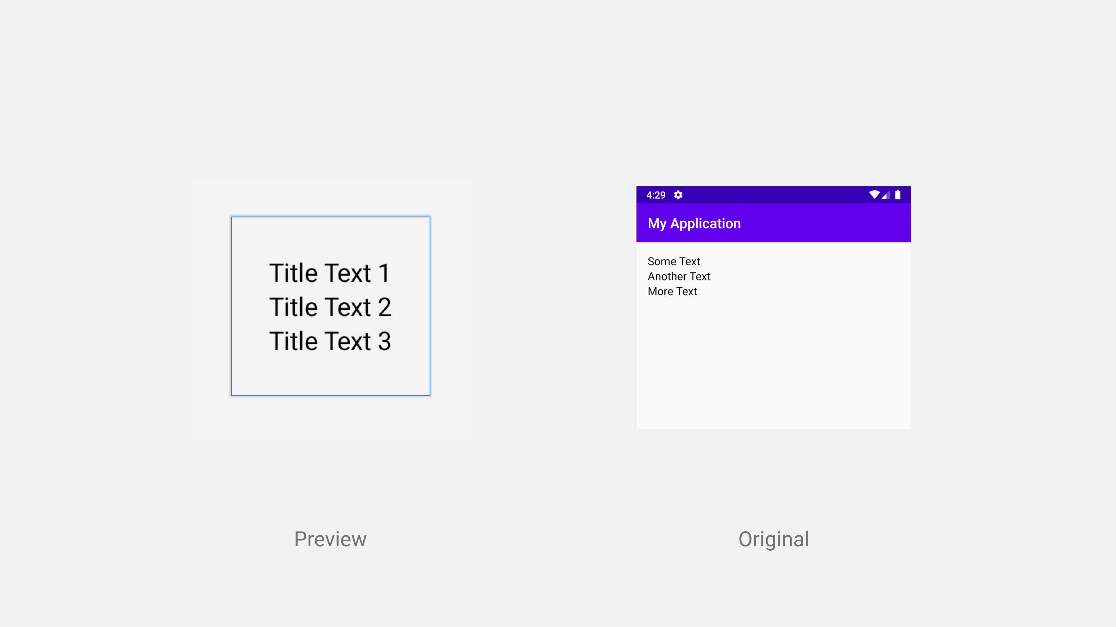
The light blue border around the texts defines the boundary of the column. That is the actual size of the column.
There are several modifiers available that you can use. Like if you want your column to take all the available space, you can use Expanded modifier.
Column(modifier = Expanded) {
    Text(text = "Some Text")
    Text(text = "Another Text")
    Text(text = "More Text")
}
Here is how it will look like this:
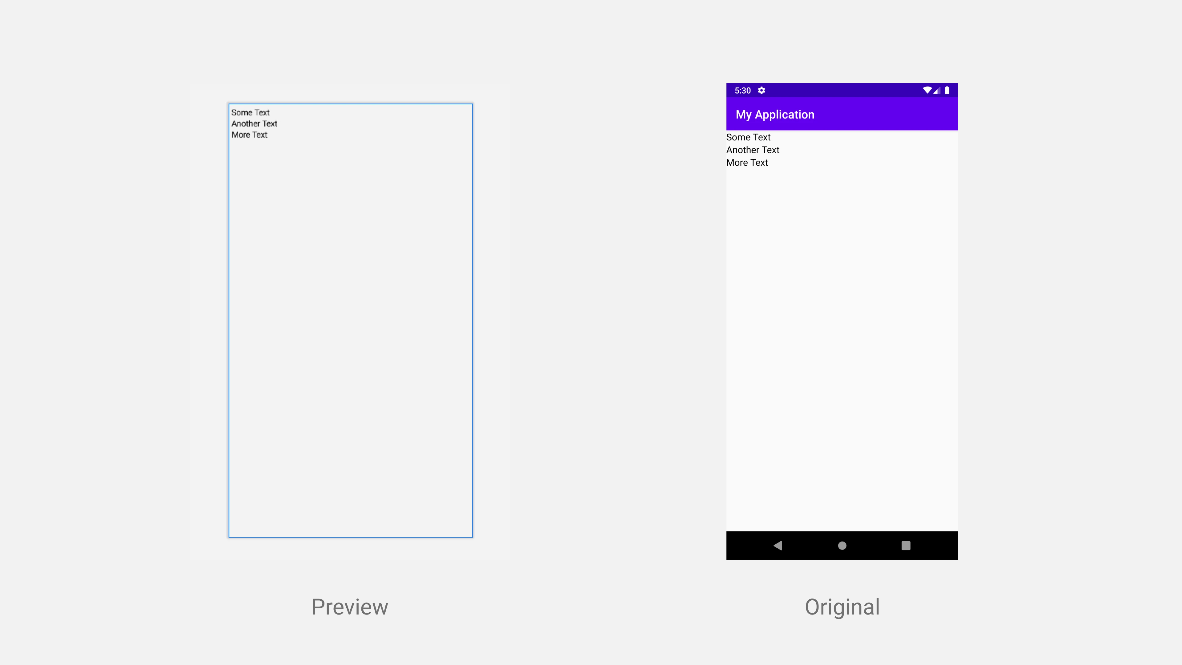
Notice the light blue border in preview. It indicates the boundary of the Column. You can see that now the Column has taken all the available space. However, you can’t tell the difference in the original screenshot as no boundary is shown there.
You might have noticed that we replaced the modifier parameter to Expanded. It resulted in losing the space that we had given previously. So the question arises: How to use multiple modifiers?
The answer is, all the modifiers provide a method called wraps() that takes another modifier as input. You can create a chain of the modifiers using wraps() method.
Column(modifier = Expanded.wraps(Spacing(16.dp))) {
    Text(text = "Some Text")
    Text(text = "Another Text")
    Text(text = "More Text")
}
And here’s how it will look:
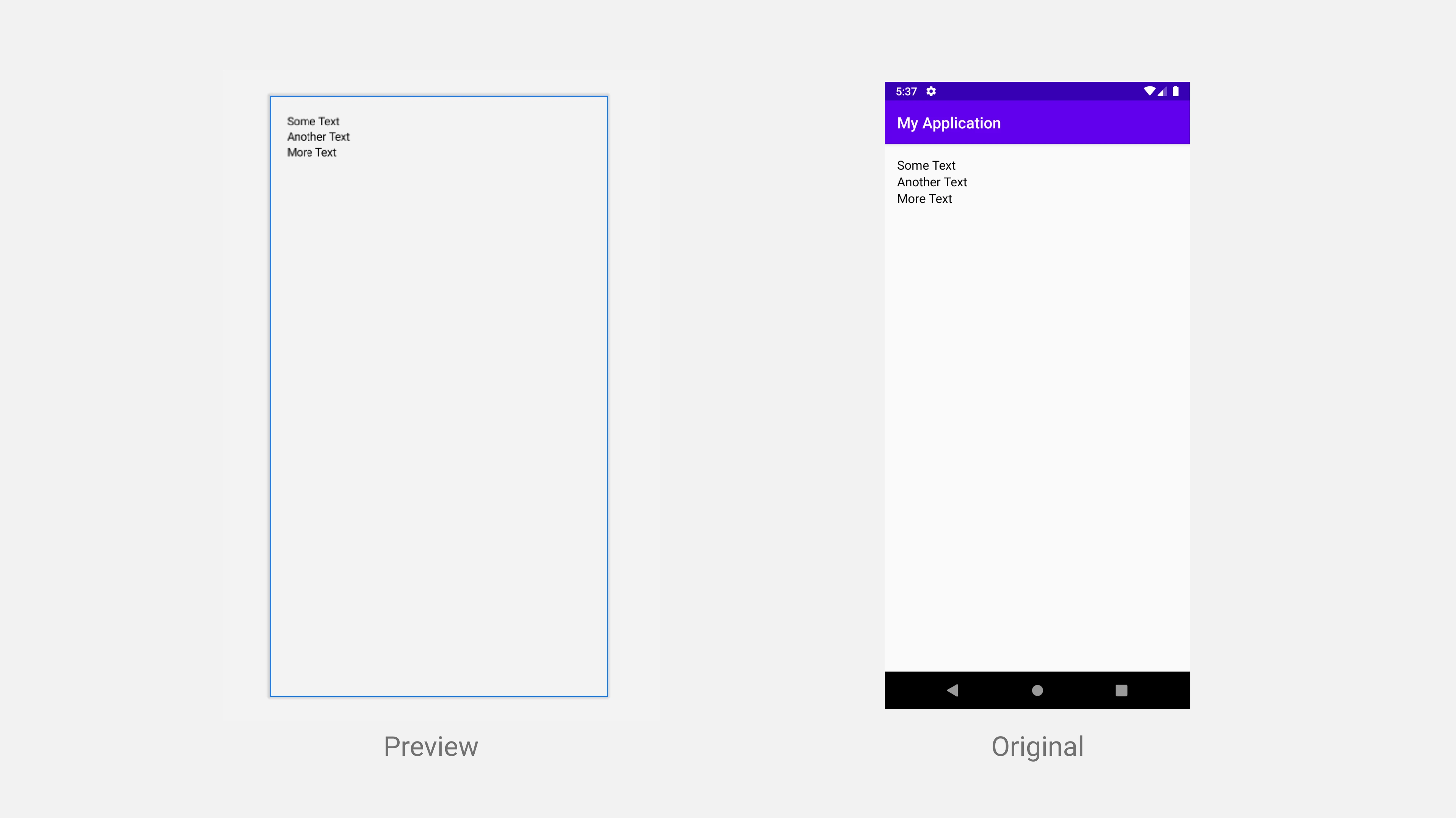
Notice the boundary and space around the texts which indicates that both the modifiers have been applied properly.
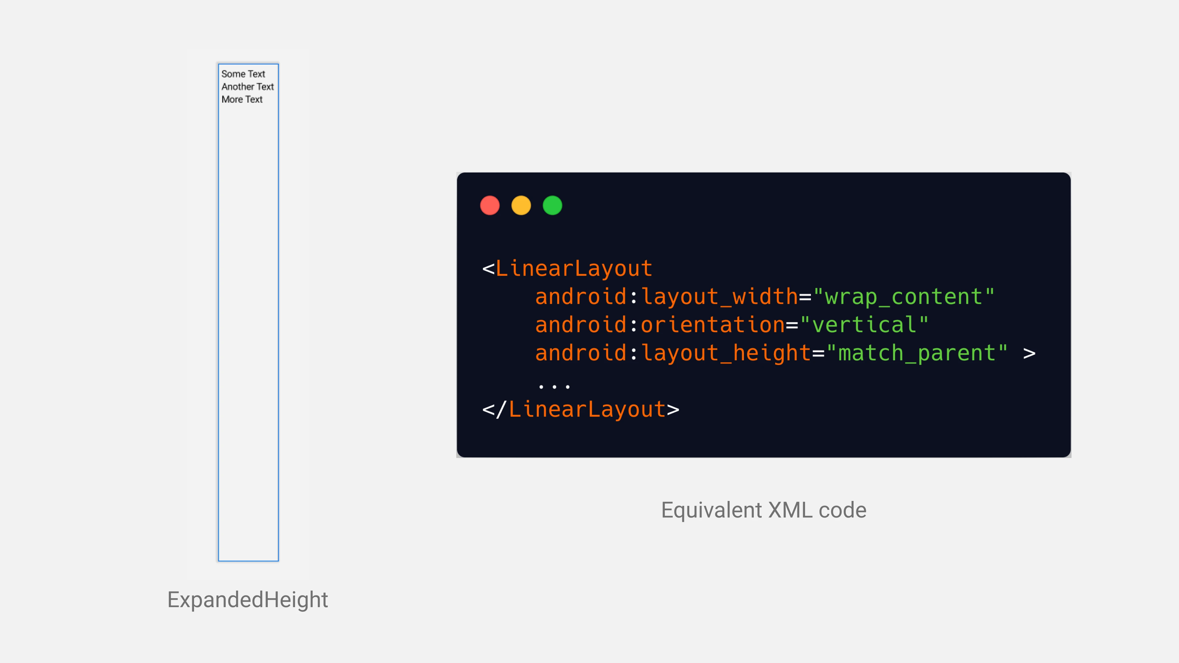
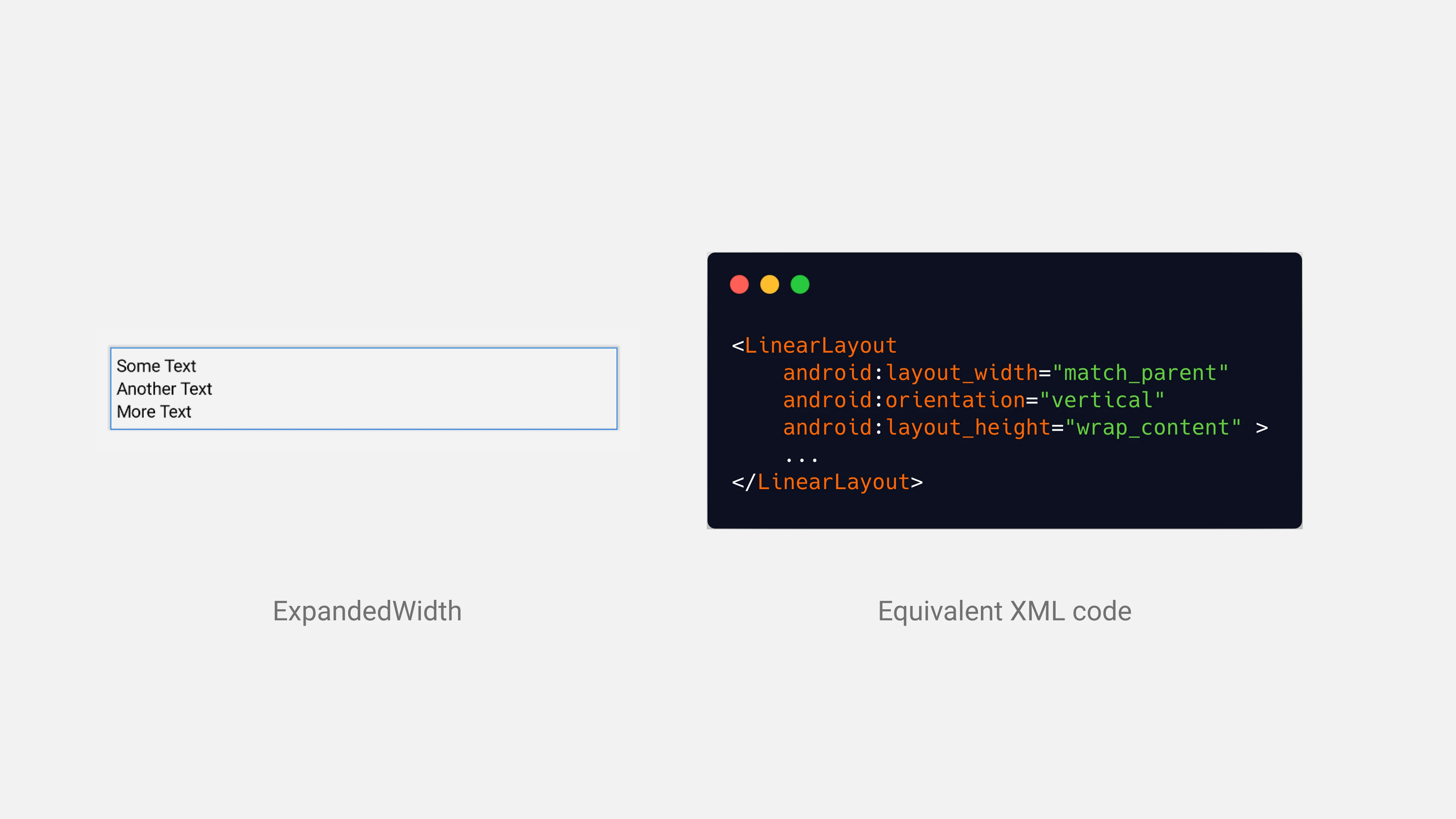
You can also expand your column only vertically or horizontally. Use ExpandedHeight to expand column vertically and ExpandedWidth to expand the column horizontally.
Expand Vertically:
Column(modifier = ExpandedHeight) {
    Text(text = "Some Text")
    Text(text = "Another Text")
    Text(text = "More Text")
}
Expand Horizontally:
Column(modifier = ExpandedWidth) {
    Text(text = "Some Text")
    Text(text = "Another Text")
    Text(text = "More Text")
}
Axis Alignment
Column and Row support axis alignment for both MainAxis and CrossAxis. If you’re familiar with Flutter then you will come around this easily. If you are not, then, in short, MainAxis refers to the main flow direction of the composable. In columns, views flow in the vertical direction, therefore, the MainAxis for Column is vertical. Whereas Row flows in the horizontal direction so the MainAxis for Row is horizontal.
CrossAxis is the total opposite of the MainAxis. For Column, CrossAxis refers to the horizontal direction and for Row, it refers to the vertical direction.
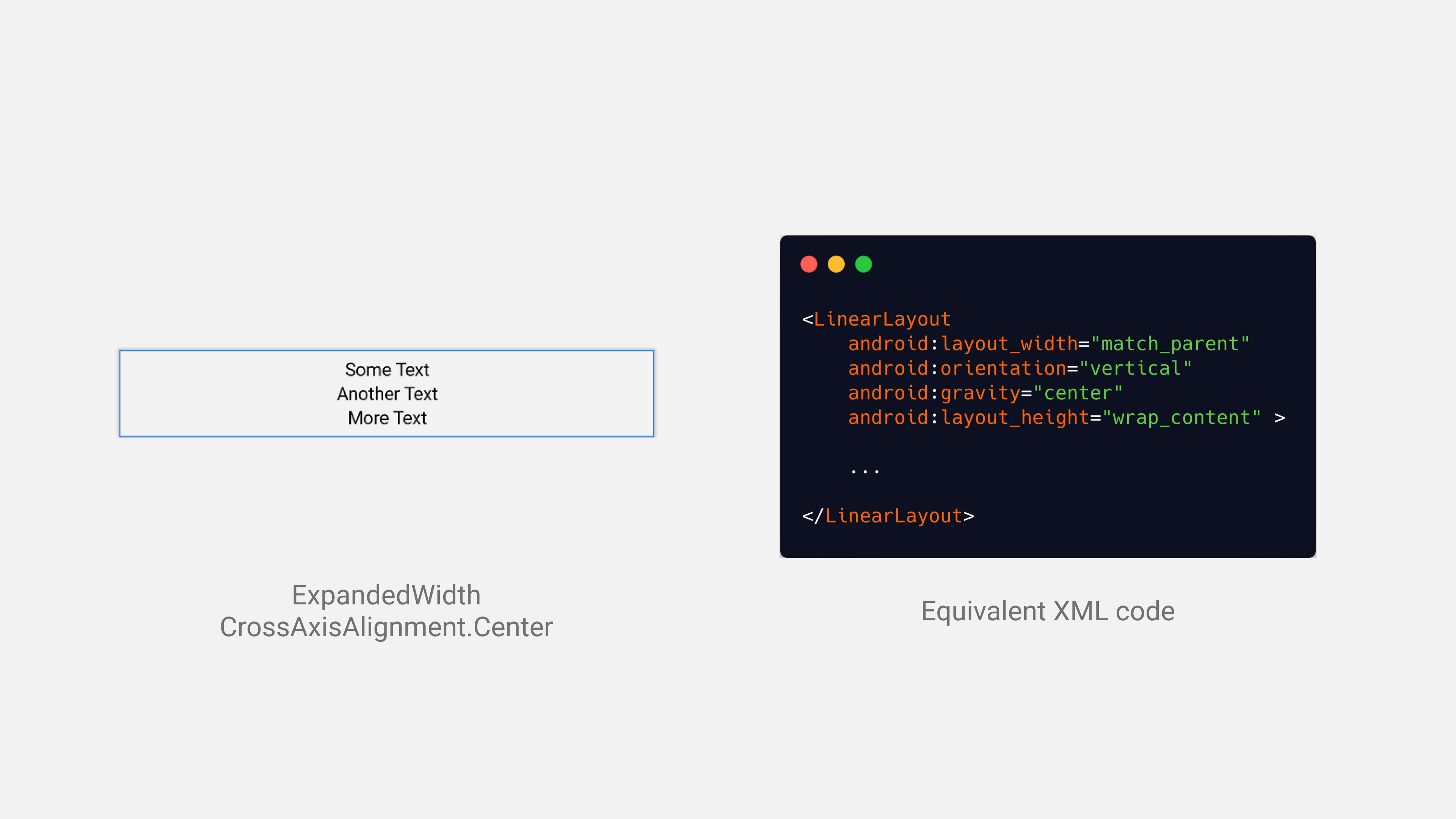
Let’s try to understand it by an example. Let’s say I want to center my views of Column in a horizontal manner. For Column, the horizontal direction is CrossAxis so you can use CrossAxisAlignment to customize the behavior of Column.
Column(
    modifier = ExpandedWidth,
    crossAxisAlignment = CrossAxisAlignment.Center
) {
    Text(text = "Some Text")
    Text(text = "Another Text")
    Text(text = "More Text")
}
This is how it will look like:
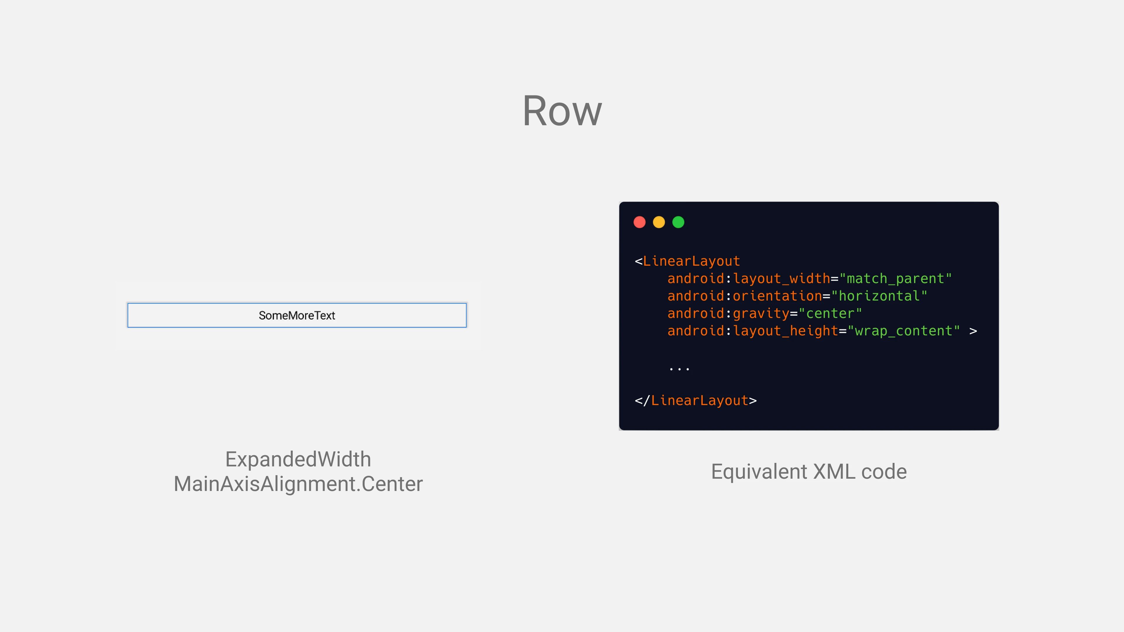
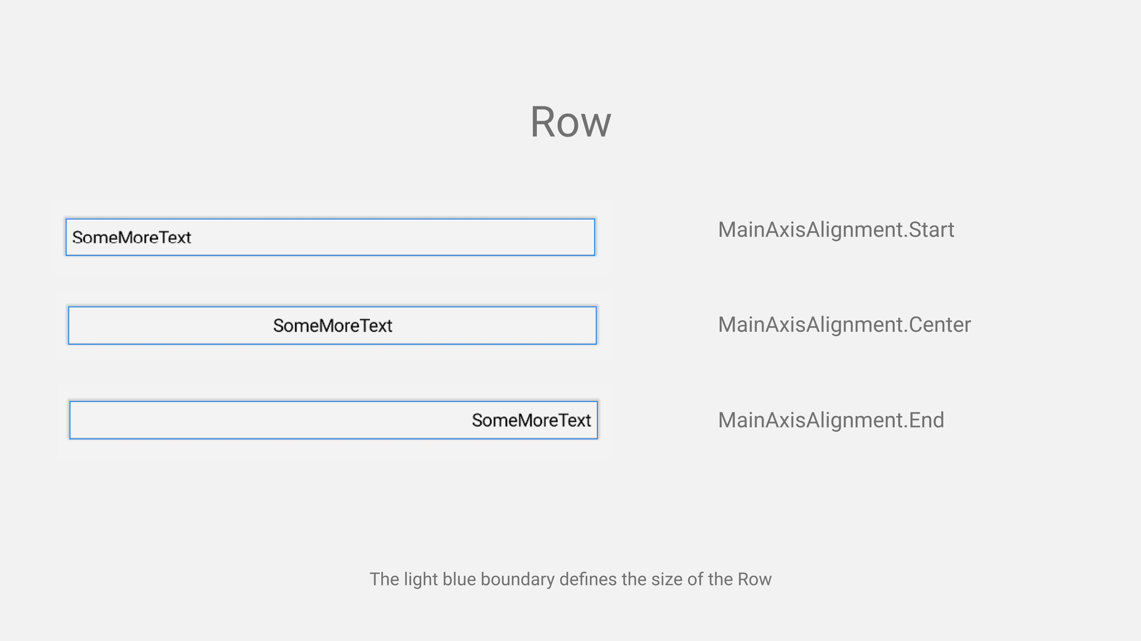
The same logic applies to the Row. Let’s say we want to center our views in Row then we have to use MainAxisAlignment as the horizontal direction is MainAxis.
Row(
    modifier = ExpandedWidth,
    mainAxisAlignment = MainAxisAlignment.Center
) {
    Text(text = "Some")
    Text(text = "More")
    Text(text = "Text")
}
Here, we’re setting mainAxisAlignment to Center so all the views in Row will be aligned in the center.
There are also 3 special kinds of modes for alignment named SpaceAround, SpaceBetween and SpaceEvenly. These alignments can only be applied to the MainAxis of the Composable which is vertical and horizontal for column and row respectively.
Here’s an example of these 3 modes demonstrating what does each of them means.
Row(
    modifier = ExpandedWidth,
    mainAxisAlignment = MainAxisAlignment.SpaceBetween
) {
    Text(text = "Some")
    Text(text = "More")
    Text(text = "Text")
}
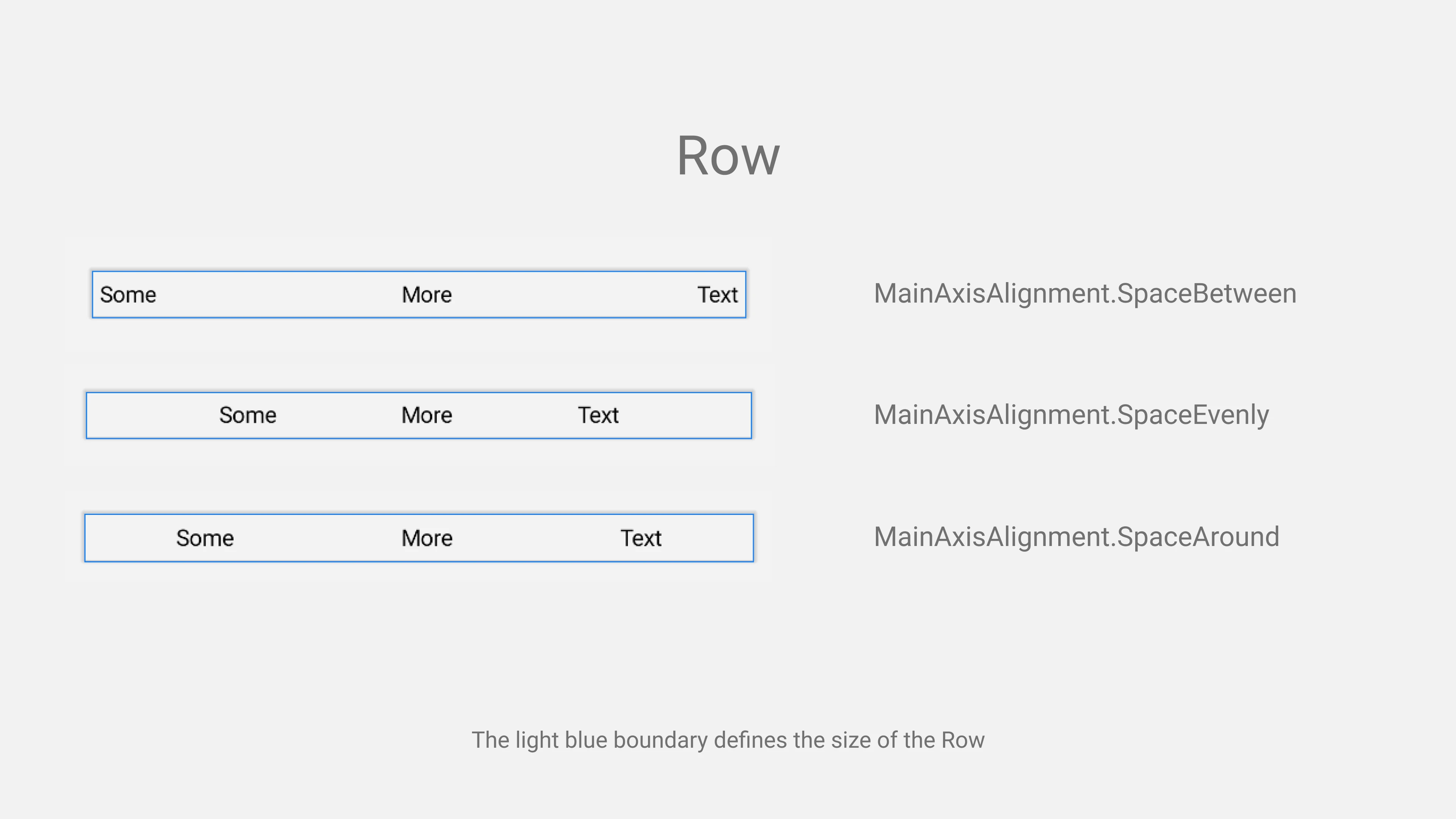
This is what docs say:
SpaceEvenly:
Place children such that they are spaced evenly across the main axis, including free space before the first child and after the last child.
SpaceBetween:
Place children such that they are spaced evenly across the main axis, without free space before the first child or after the last child.
SpaceAround:
Place children such that they are spaced evenly across the main axis, including free space before the first child and after the last child, but half the amount of space existing otherwise between two consecutive children.
Axis Size
You can also specify the size of the axis for both CrossAxis and MainAxis. The value could be LayoutSize.Wrap and LayoutSize.Expand. Layout.Expand is identical to ExpandedHeight and ExpandedWidth. So you can use either of them.
Although, modifier has higher priority over axis size. Let’s say we apply modifier = ExpandedHeight and mainAxisSize = LayoutSize.Wrap to the Row composable. In the first part, we’re telling Row to take all the available space and in the second part, we’re telling it to take minimum space it requires. Sounds conflicting, right? If you run below code demonstrating this situation then you can see that the mainAxisSize is ignored.
Row(modifier = ExpandedWidth,
    mainAxisSize = LayoutSize.Wrap
) {
    Text(text = "Some")
    Text(text = "More")
    Text(text = "Text")
}
If you run above code, you will get output like this:
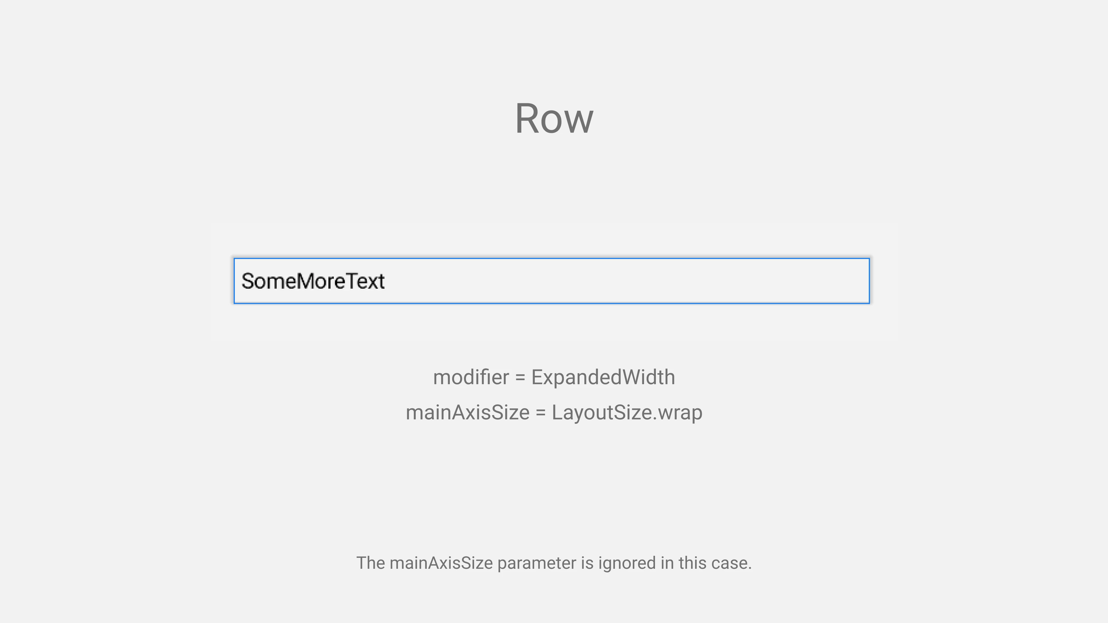
So the conclusion is that the mainAxisSize has less priority over modifier when the conflict happens.
Final Words
That’s it. That’s all you need to know about Row & Column composable. You’ll find it difficult in the beginning if you aren’t familiar with Flutter but after some time you’ll find it pretty easy and straightforward to use. There is a whole new world of Composable like these. Explore and learn as much as you can.
If you like what you read and learned, don’t forget to share it. Happy coding!